
Determining Distribution of Hazardous Chemicals
This dataset, obtained from the California Health and Human Services, consists of 114,635 records and 22 columns, detailing product names along with reported hazardous chemicals. Key columns feature the brand name, chemical name, and the report date. As indicated on their website, the dataset encompasses records from 2007 up to the present, with the latest entry cited as of October 2023. My analysis focused on applying three statistical methods: manual data normalization of frequency, Kernal Density Estimate (KDE), and bivariate KDE.
For my analysis, I aimed to answer four questions:
First, how can the data be normalized to determine “common” chemicals among different product categories?
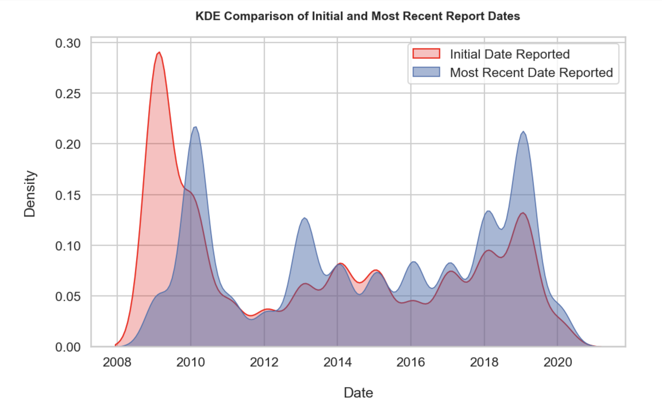
Second, what is KDE of inital report verus latest report dates?
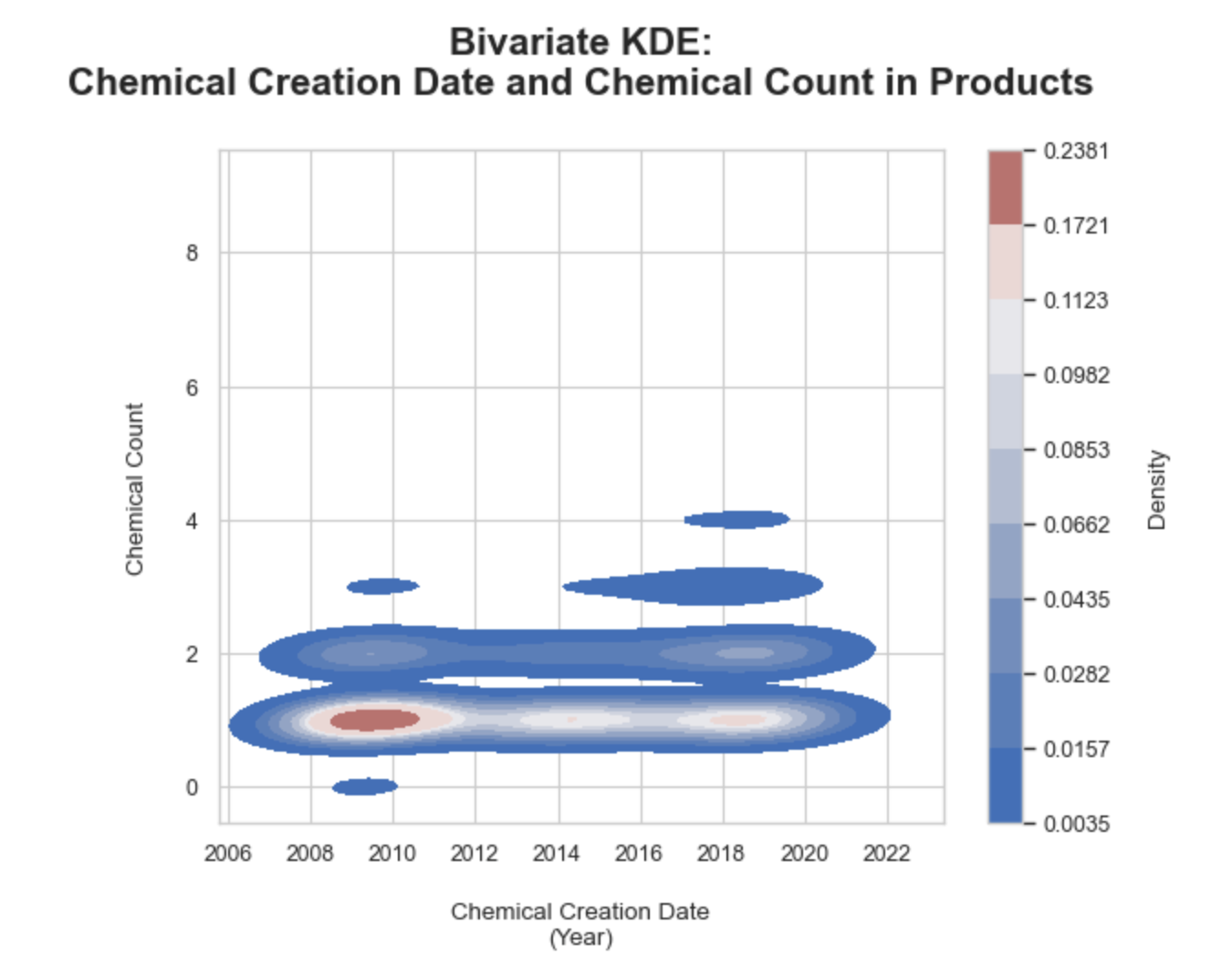
Third, what is the bi-variate KDE relationship between the number of chemicals in a product and report date?
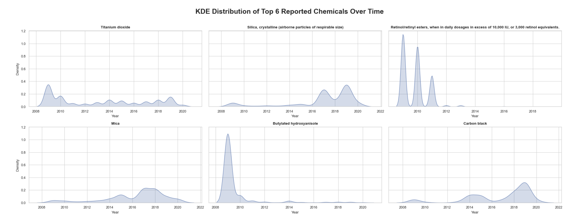
Fourth, what is the KDE of the top 6 reported chemicals over time?
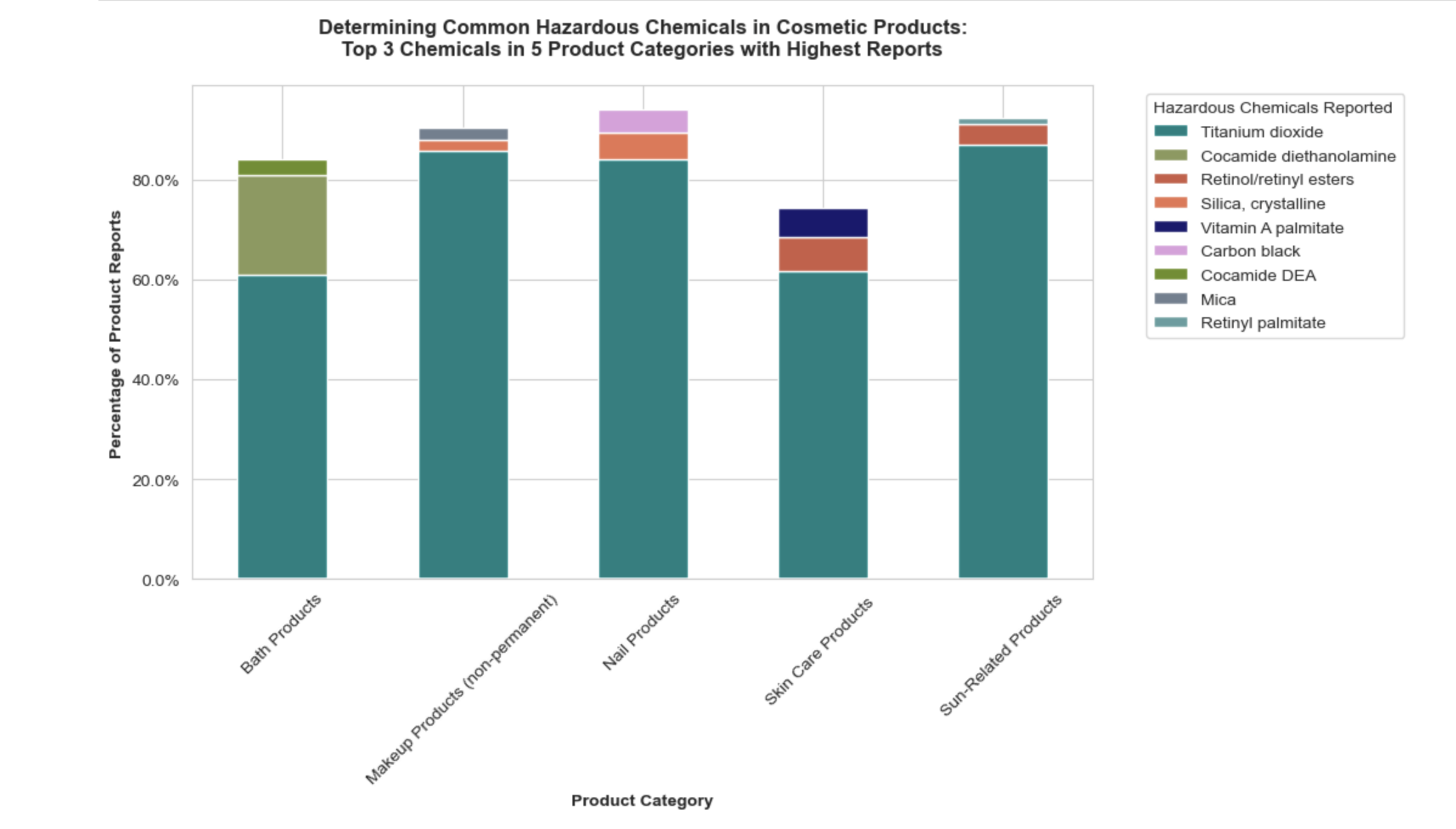
1. Stacked box plot of normalized data to determine common chemicals:
The methodology encompassed grouping products by primary categories and chemicals, calculating the frequency of each chemical within its primary category, then calculating the percentage by dividing by the total chemical count for each primary category, and visually representing these percentages to identify trends. This manual normalization is one way of finding a quantitative “common” chemical.
To prepare for visualization, the data was refined to focus on the top 5 categories and top 3 chemicals by frequency percentage, and chemical names were simplified for clarity. A custom color map was created for the selected chemicals, and a pivot table facilitated a smoother stacked bar plot visualization. This visualization aimed to highlight the most common hazardous chemicals across the product categories and the common colors applied for unique chemical names across the 5 categories does successfully portray normalized commonalities and differences.
Key observations:
• Notably, titanium dioxide emerged as a prevalent chemical, classified as a possible carcinogen when inhaled in powder form.
• The second was Silica crystalline which can be a group 1 carcinogen depending on its form
2. KDE comparison of initial report date and most recent report dates:
Utilizing the seaborn KDE plot option, the two different date columns were juxtaposed to interpret trends. The KDE function represents the probability density function (PDF), which indicates the relative likelihood of the continuous variable input taking on a value. Unlike my manual normalized distribution above which is a percentage, the KDE unit is a ratio of probabilities to the range of values. Therefore the whole area under the curve for a variable is equivalent to 100%. KDE applies a arithmetic “smoothing” technique determined by the bandwidth denominator which can be manually adjusted with bw_adjust. The key to applying said smoothing technique is not only applying an appropriate bandwidth for visualization but also ensuring the variables are continous and therefore infinitely divisible.
Key observations:
• There have been less chemical reports past the 2018 peak as indicated by the right tail
• The two date columns demonstrate a lot of overlap in which logically the initial report date and follow-up report date spiking and dropping around similar dates
• Around 2016 there is a gradual build up of both report dates coinciding with the known rise of makeup and beauty influencers on social media
• The website notes that not all products containing toxicants may be included to due companies failing to report, therefore the tail and drops after 2018 may not indicate a true decline in hazardous chemical usage
3. Bivariate KDE of chemical count by product and inital report date:
Determining if over time products have reported less, more, or the same number of chemicals per product utilizing a bivariate KDE plot. Similar to a univariate KDE, this bivariate KDE application is also a density plot, but each axes is a designated continous variable and therefore the density is a joint density value focused on correlation. The two axes are the chemical creation date as a year in the x-axis and the number of chemicals counted in a product on the y-axis. The gradient bar was added to the right as a legend.
Key observations:
• Overall the number of hazardous chemicals reported has primairly been 1-2 chemicals per product from 2006 to 2022 as shown with the long KDE bands
• Overtime the two concentrated bands in number of chemicals reported per product parallel the two peaks in KDE of initial report dates and follow up report dates from the previous plot
4. KDE top 6 reported chemicals over time:
In order to understand the temportal trends of the 6 most frquent chemicals reported, a KDE subplot was implemented for each. The dataset was queried to determine the top 6 based on the count of occurances. The dataset was then filtered for the top 6. Next, the year was extracted from the initial report date column and appended as a new column to use as the x-axis. The plot generation made use of two important functions; a for loop to compute the KDE plot values for each chemical and flatten() to transform the resulting array into a one dimensional array which makes subplotting easier. I kept the long original version of each chemical name because the subplot layout could handle them.
Key observations:
• Unlike previous KDE plots, the chemical reports by chemical demonstrate less correlation to the common peaks and concentration bands around 2009 and 2018
• Chemicals like titanium dioxide and mica demonstrate more consistent reporting over time and therefore suggest a relatively steady usage in products
• The most peculiar chemical plot is butylated hydroxyanisole which shows pronounced peaks, which may indicate changes in industry standards or regulation changes
The Code
Determining the frequency as a percentage for each primary category
# (1) Determine the number of reports for each product type, the overarching category a product belongs to

# Groupby PrimaryCategory and Chemical name
# Use .size() to count the number of rows for the selected columns
# Created as a new df by applying .reset_index, and applying a new titles 'Count' for the results of .shape
count_prodtype = cscpop.groupby(['PrimaryCategory', 'ChemicalName']).size().reset_index(name='Count')

count_prodtype.head(10) # Verify work, this also put the df in alphabetical order by PrimaryCategory
# Note: this is still too many rows and products to determine if there is a "common" hazardous product

# (2a) Determine the frequency of each chemical as a percentage of the total counts within its respective PrimaryCategory

# Calculate the totle counts by category as a new row, keep naming conventions of columns
# Use .transform() to directly apply the calculation sum back into the dataframe
count_prodtype['TotalCount'] = count_prodtype.groupby('PrimaryCategory')['Count'].transform('sum')
# count_prodtype # Check work, Primary Categories do have the same total counts in new column

# (2b) Calcuate the percentage that each chemical represents
# Divide the count of each chemical by the total count by Primary Category
# Round the precentage to two decimal places
count_prodtype['FrequencyPercent'] = ((count_prodtype['Count'])/(count_prodtype['TotalCount'])*100).round(2)

# (3) Inspect df results
count_prodtype # This looks accurate, next cell will visualize the results to determine trends
count_prodtype
Visualization 1, stacked bar plot of normalized data
# (1a) Select only the top 5 primary categories by total count
top_5_cat = count_prodtype.groupby('PrimaryCategory')['TotalCount'].sum().nlargest(5).index

# (1b) Get the frequency percentages for each chemical within each category
chemicals_in_top_categories = count_prodtype[count_prodtype['PrimaryCategory'].isin(top_5_cat)]

# (1c) Sort the chemicals by FrequencyPercentage and extract the top 3
top_chemicals_by_category2 = chemicals_in_top_categories.groupby('PrimaryCategory').apply(
    lambda x: x.sort_values('FrequencyPercent', ascending=False).head(3)
).reset_index(drop=True)

# (2a) Rename the row values containing long chemical names because they are too long for plots
# Use regex to replace values that start with 'Retinol/retinyl esters' and have additional text after it
# the column name was too long to use other methods
top_chemicals_by_category2['ChemicalName'] = top_chemicals_by_category2['ChemicalName'].str.replace(
    r'^Retinol/retinyl esters,.*$', 'Retinol/retinyl esters', regex=True
)

# (2b) Repeat on another row value within the same column
# this one has special characters, escape with backslash
top_chemicals_by_category2['ChemicalName'] = top_chemicals_by_category2['ChemicalName'].str.replace(
    r'^Silica, crystalline \(airborne particles of respirable size\)$', 'Silica, crystalline', regex=True
)

# (3a) Create a custom color map for the unique chemical names

# Assign hex color values
colors_subgroup = [
    "#191970",  # dark blue
    "#6b8e23",  # brighter green
    "#e97451",  # orange
    "#dda0dd",  # pink
    "#008080",  # teal
    "#708090",  # Slate Gray
    "#5f9ea0",  # dull blue/grey
    "#cd5b45",  # orange
    "#8a9a5b"   # green
]

# (3b) Create list of unique chemical names
chemicals = [
    'Vitamin A palmitate',
    'Cocamide DEA',
    'Silica, crystalline',
    'Carbon black',
    'Titanium dioxide',
    'Mica',
    'Retinyl palmitate',
    'Retinol/retinyl esters',
    'Cocamide diethanolamine'
]

# (3c) Zip into a dictionary for color mapping that can be adjusted
chemical_color_map = dict(zip(chemicals, colors_subgroup))

# (4a) Pivot the df in order to use the chemical names as columns for each primary category
# this is a pivot wider type in R
top_categories_pivot = top_chemicals_by_category2.pivot_table(index='PrimaryCategory',
                                                  columns='ChemicalName',
                                                  values='FrequencyPercent',
                                                  aggfunc='sum').fillna(0)

# (4b) In order to plot the box plot from largest "box" to smallest "box" calculate the sum
column_sums = top_categories_pivot.sum()

# (4c) Sort the output column sums
sorted_columns = column_sums.sort_values(ascending=False).index.tolist()

# (4d) Extract the chemicals as a list
chemicals_in_df = top_categories_pivot.columns.tolist()

# (4e) Based on the previous sorted columns of sums, reorder the pivoted dataframe
top_categories_sorted = top_categories_pivot[sorted_columns]

# (5) Call the colors in order from the color map
sorted_barcolors = [chemical_color_map[chem] for chem in sorted_columns]

# Function to format the tick labels as percentages
def to_percentage(x, pos):
    return f'{x}%'

# Plot Adjustments
sns.set_style("whitegrid")

# (6) Plot the stacked bar plot
top_categories_sorted.plot(kind='bar',
                     stacked=True,
                     figsize=(11, 6.8), # adjust to fill
                     color=sorted_barcolors) # use the sorted color which uses the color map
plt.title(label = 'Determining Common Hazardous Chemicals in Cosmetic Products:\n'
          'Top 3 Chemicals in 5 Product Categories with Highest Reports\n',
         fontweight='bold')
plt.ylabel(ylabel = 'Percentage of Product Reports',
          fontweight='bold')
plt.xlabel(xlabel = 'Product Category',
          fontweight = 'bold')
# Apply the formatter to the y-axis
plt.gca().yaxis.set_major_formatter(FuncFormatter(to_percentage))

plt.xticks(rotation=45, ha='center')  # Rotate labels 45 degrees, because they are long
plt.legend(title='Hazardous Chemicals Reported ', bbox_to_anchor=(1.05, 1), loc='upper left')
plt.tight_layout()

plt.show()
Visualization 2, KDE of two date variables
# (1a) Verify date format for the columns IntitialDateReported and MostRecentDateReported
# Convert to date useing to_datetime() for ea. column
cscpop['InitialDateReported'] = pd.to_datetime(cscpop['InitialDateReported'])
cscpop['MostRecentDateReported'] = pd.to_datetime(cscpop['MostRecentDateReported'])

# (2) Determine the range of dates for the ea. column
# print(cscpop['InitialDateReported'].min(), cscpop['InitialDateReported'].max())
# print(cscpop['MostRecentDateReported'].min(), cscpop['MostRecentDateReported'].max())

# (3) Transform the date columns to a format comprised of year and month
# Divide the month to be a fraction of the year, it will then be a decimal value relective of the numerical month
cscpop['InitialYearMonth'] = cscpop['InitialDateReported'].dt.year + cscpop['InitialDateReported'].dt.month / 100
cscpop['MostRecentYearMonth'] = cscpop['MostRecentDateReported'].dt.year + cscpop['MostRecentDateReported'].dt.month / 100

# (4) Set up plot, use sns.kdeplot(), plot first column
plt.figure(figsize=(12, 7))
sns.kdeplot(cscpop['InitialYearMonth'],
            fill=True,
            color="red", # use fill not shade
            label="Initial Date Reported")

# (5) Style and define plot fill
sns.set(style='whitegrid') # set theme
sns.set_context("talk") # set to talk to make the scale easy to read

#  (6) Define the second column to plot
sns.kdeplot(cscpop['MostRecentYearMonth'],
            fill=True,
            color="b",
            alpha=0.5,
            linewidth=1.2,
            label="Most Recent Date Reported")

plt.title('\nKDE Comparison of Initial and Most Recent Report Dates\n',
         fontweight='bold',
         fontsize=15)
plt.xlabel('\nDate')
plt.ylabel('Density\n')
plt.legend()
plt.show()
Visualization 3, bivariate KDE of chemical count and creation date
# (1) Format the column ChemicalCreatedAt to a date format and then a year.month format
cscpop['ChemicalCreatedAt'] = pd.to_datetime(cscpop['ChemicalCreatedAt'])
cscpop['ChemicalCreatedYearMonth'] = cscpop['ChemicalCreatedAt'].dt.year + cscpop['ChemicalCreatedAt'].dt.month / 100

# (2) Set the plot with each column as an axis
sns.kdeplot(
    x=cscpop['ChemicalCreatedYearMonth'],
    y=cscpop['ChemicalCount'],
    cmap="vlag",
    bw_adjust=2,
    cbar=True, # set the color map as the gradient bar values
    fill=True, # set fill to true to see continuous fill
    cbar_kws={'label':'\nDensity'} # label color bar legend
)

# (3) Style and define plot scale
sns.set(style='whitegrid') # set theme
sns.set_context("paper") # set to paper to include more details

# (4) Set labels
plt.title('\nBivariate KDE:\n' 'Chemical Creation Date and Chemical Count in Products\n',
         fontweight='bold',
         fontsize='15')
plt.xlabel('\nChemical Creation Date\n' '(Year)')
plt.ylabel('\nChemical Count\n')

plt.show()
Visualization 4, KDE of top 6 chemicals
# (1) Identify the top 6 chemicals reported using count, then take the .head(6) because this will make a good subplot layout
top_6chemicals = cscpop['ChemicalName'].value_counts().head(6).index

6# (2) Filter for only the top 6 chemicals
top_6chemicals_data = cscpop[cscpop['ChemicalName'].isin(top_6chemicals)]

# (3) Determine the year from the InitialDateReported column
top_6chemicals_data['Year'] = top_6chemicals_data['InitialDateReported'].dt.year

# (4a) Set the number of subplots based on 6 top chemicals
fig, axes = plt.subplots(2, # rows
                         3, # columns
                         figsize=(20, 8),
                         sharey=True)

# (4b) Will use a for loop to iterate and determine the kde for each chemical instead of plotting each manually
axes_flat = axes.flatten() # transform to a one dimensional array for the for loop

for i, chemical in enumerate(top_6chemicals):
    subset = top_6chemicals_data[top_6chemicals_data['ChemicalName'] == chemical]
    ax = sns.kdeplot(subset['Year'],
                     ax=axes_flat[i],
                     fill=True,
                     bw_adjust=0.8)
    ax.set_title(chemical,
                fontweight='bold',
                fontsize=11.5) # make each chemical subplot name bold for clarity
    ax.set_xlabel('Year') # do not supress y-label
# do not set common y-label it causes a repeat in the middle of the rows

# (5) Add overall title
fig.suptitle('\nKDE Distribution of Top 6 Reported Chemicals Over Time\n',
             fontsize=18,
             fontweight='bold')
plt.tight_layout()
plt.show()
Data Sources:
https://data.chhs.ca.gov/dataset/chemicals-in-cosmetics
https://www.cancer.org/cancer/risk-prevention/understanding-cancer-risk/known-and-probable-human-carcinogens.html