Exploring COVID-19 Data Sets from Different Sources
R Programming Course from University of Boulder Colorado
The R Programming course from the University of Boulder Colorado provided me the fundamental tools and concepts for coding in R, cleaning data, and visualizing data analysis. The capstone project focused on the COVID-19 trends, the key points of analysis and visualization are provided below.
1. Total Number of Cases and Deaths from the NY Times data:
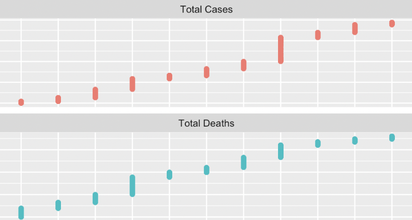
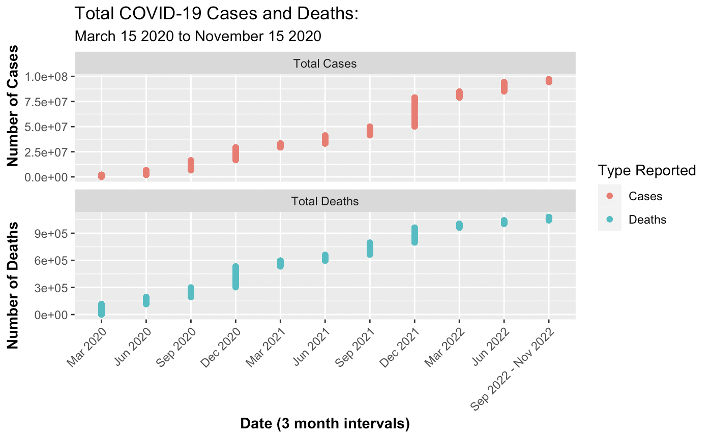
The first step was merging the data sets for 2020, 2021, and 2022. To verify that the merges were data comprehensive the rows were summed, excluding Puerto Rico, and compared to the Google and New York Times website reports. Correspondingly, the total cases online for November 2022 was approximately 97.8 million and the sum from the merged data was a close figure at 96, 780, 395. Creating a visual representation posed a challenge due to the disparity in magnitude between cases and deaths. The solution implemented was dual y-axes and single x-axes to enhance distinction but minimize label clutter. The representation employs triadic based color differentiation to convey a difference in variables presented.
2. Analyzing the difference between the total cases and deaths versus the total cases and deaths per 100,000 people on a national and state scale:
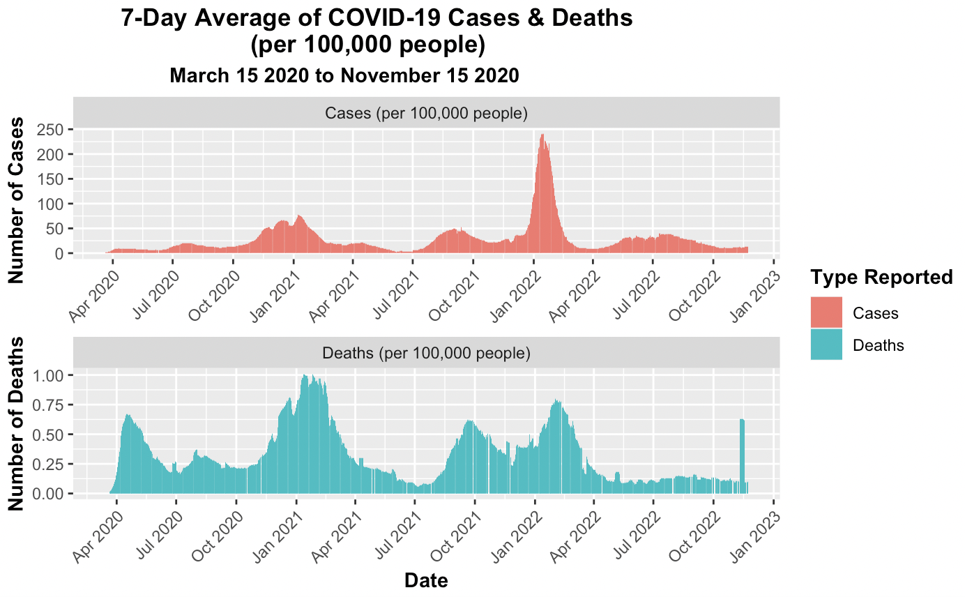
These two visualiztions required a different origin point to be set because rather than using zero as the start date for COVID-19, the earliest recorded case observation from the data set was March 15, 2020. The first case observation row had 68 cases. The distinction in origin prevented distortions. The function rollmeanr from the package zoo was employed to calculate the rolling 7-day average, the function conveniently allows for the treatment of NA values. The California plots display a few anomolies where the data seems to report a negative number of deaths, but this is due to the difference in cases being less between the two successive dates. While this may be misleading upon initial glance, but setting an extra condition where a negative difference is set to zero would be changing the data provided. Therefore, the negative death results were kept.
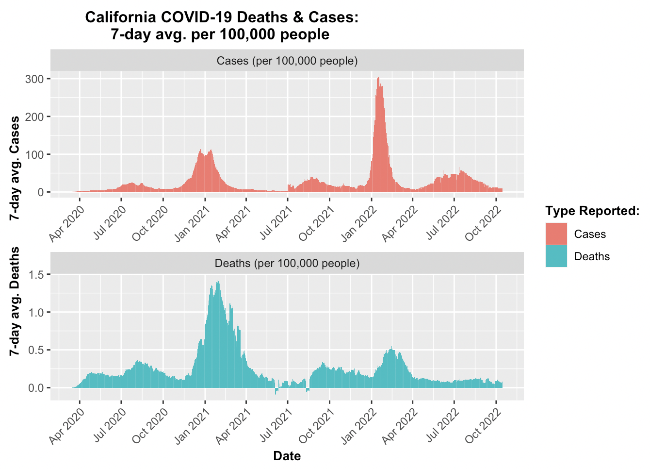
# Create a visualization to compare the seven-day average cases and deaths
## per 100,000 people.
## 1) let's organize a table like before that has a "type"
## which means using pivot_longer() to combine:
## avg7_cases_100k & avg7_deaths_100k

plot_7avg_by_100k <- by_date_100k %>%
  pivot_longer(
    c('avg7_deaths_100k', 'avg7_cases_100k'),
    names_to = "avg7_per100k",
    values_to = "avg7_per100k_value"
  )

## 2) select the values we will be working with, we see there is a repeat
##    so the first 14 values are NA
plot_7avg_by_100k %>%
  select(date, avg7_per100k, avg7_per100k_value)

## 3) change the date into a 3-month interval like before
plot_7avg100k_interval <- data.frame(date=as.Date(c(plot_by_date_idea$date))) %>%
  mutate(date2 = case_when(date >= "2022-09-15" ~ "Sep 2022 - Nov 2022",
                           date >= "2022-06-15" ~ "Jun 2022",
                           date >= "2022-03-15" ~ "Mar 2022",
                           date >= "2021-12-15" ~ "Dec 2021",
                           date >= "2021-09-15" ~ "Sep 2021",
                           date >= "2021-06-15" ~ "Jun 2021",
                           date >= "2021-03-15" ~ "Mar 2021",
                           date >= "2020-12-15" ~ "Dec 2020",
                           date >= "2020-09-15" ~ "Sep 2020",
                           date >= "2020-06-15" ~ "Jun 2020",
                           date >= "2020-03-15" ~ "Mar 2020",
                           TRUE ~ "other"))
## 4) left join the two tables
plot_avg7_100k_check <-
  left_join(
    plot_7avg_by_100k,
    plot_7avg100k_interval,
    by =
      "date"
  )

plot_avg7_100k_check <- plot_avg7_100k_check %>%
  select(date, avg7_per100k, avg7_per100k_value, date2)

## 5) keep only the distinct values
##    this erases the NA values from March 16 to March 20

plot_avg7_100k_check <- plot_avg7_100k_check %>%
  distinct(avg7_per100k_value, .keep_all = TRUE)
## 5b) replace the NA values with 0 for the plot
plot_avg7_100k_check[is.na(plot_avg7_100k_check)] <- 0

## 6) now plot
## 7) create variable function to call on facet_wrap
variable_names2 <- list(
  "avg7_cases_100k" = "Cases (per 100,000 people)" ,
  "avg7_deaths_100k" = "Deaths (per 100,000 people)"
)

variable_labeller2 <- function(variable, value){
  return(variable_names2[value])
}

plot_avg7_100k_check %>%
ggplot(aes(x = date,
           y = avg7_per100k_value,
          fill = avg7_per100k))+
         geom_bar(stat = 'identity',
                  size = .25, na.rm = TRUE)+
  facet_wrap(~ avg7_per100k,
             nrow =  2,
             scales = "free", labeller = variable_labeller2)+
  labs(x = "Date",
       y = "Number of Deaths         Number of Cases",
       fill = "Type Reported")+
  theme(title = element_text(face = "bold"),
        axis.text.x = element_text(angle = 45, hjust = 1),
        axis.title.y = element_text(face = "bold"),
        axis.title.x = element_text(face = "bold"))+
        ggplot2::labs(title =
              "       7-Day Average of COVID-19 Cases & Deaths
                          (per 100,000 people) ",
               subtitle = "                 March 15 2020 to November 15 2020")+
        scale_fill_discrete(labels = c("Cases", "Deaths"))+
  scale_x_date(date_labels = "%b %Y",
               date_breaks = "3 months")
3. California COVID-19 map visualization:
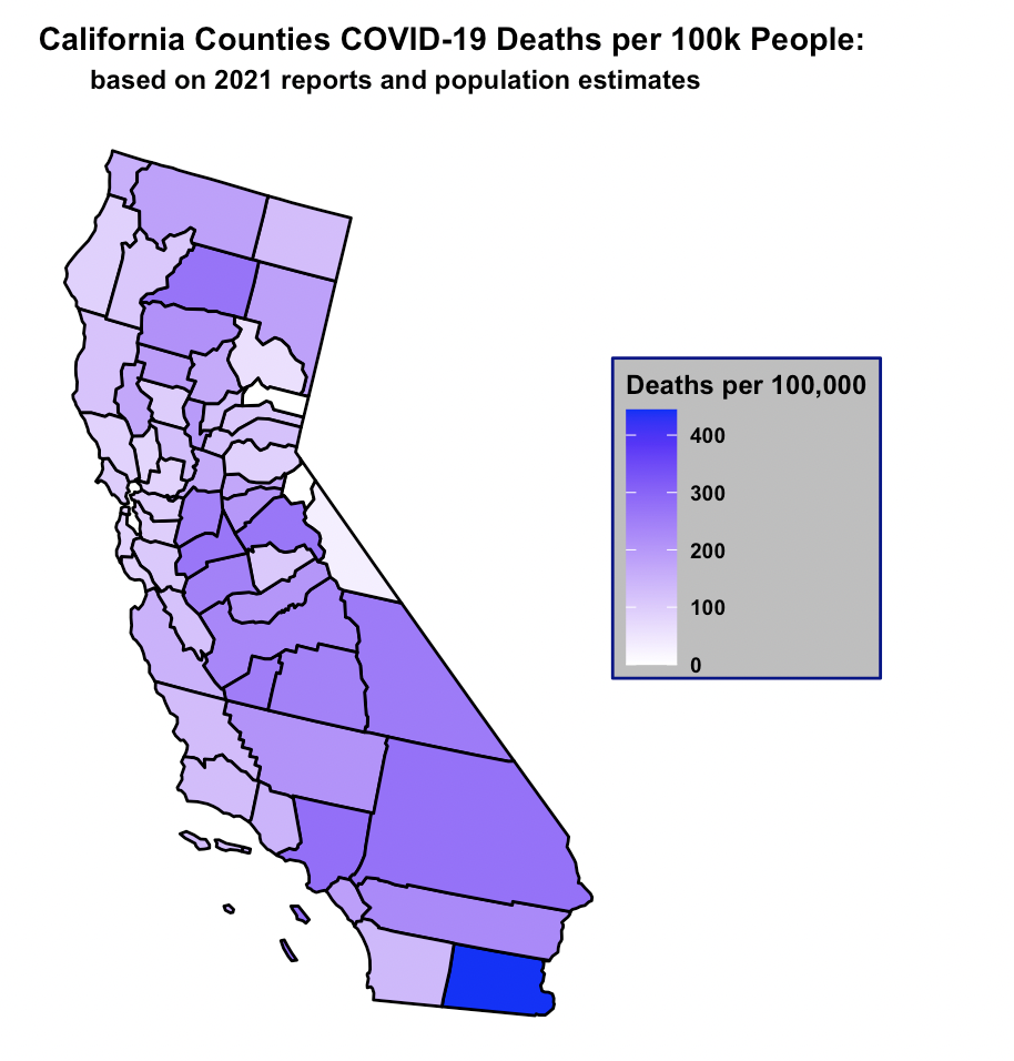
Exploring the statistical differences in totals versus normalized data, produced significant differences.
In CA, the 5 counties with the highest rates of cases and deaths per 100,000
as of 2021 were:
(1) Lassen
(2) Kings
(3) Imperial
(4) Tulare
(5) San Bernadino
The top 5 counties per 100,000 produced a different top 5 ranking than the total count. The per 100,000 people
ranking reflects counties that on average have lower incomes.
Creating a gradient map of California emphasized that the it was not the most populous coastal counties that
had the highest rates of cases and deaths per capita, but rather inland counties that may have had difficulties accessing medical resources.
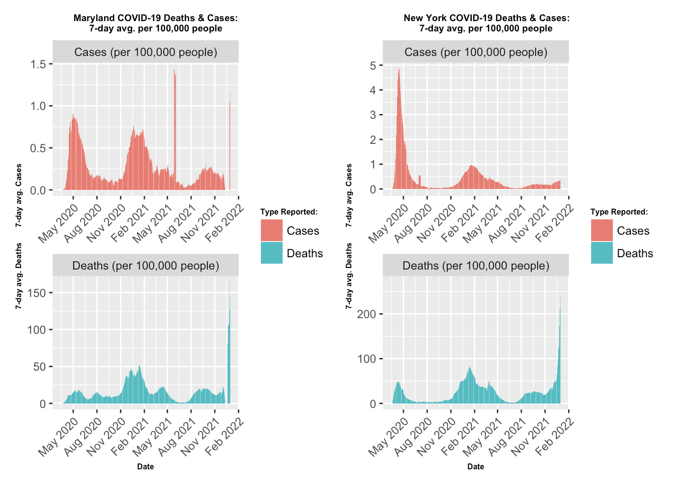
- Comparing Maryland and New York 7-day avg. per 100,000 people: After filtering the NY Times data set for Maryland and New York, the data was aggragated to verify the new daily counts for cases and deaths. Next, a for loop was implemented to compute the day-to-day variations in order to set up subsequent 7-day rolling average calculation. The smoothing technique employed by the function once again provided the optial representative view of the pandemic’s progress. The visualization of the two states utilized facet_wrap from ggplot to display side by side plots. The color scheme was kept the same throughout the project to reinforce the meaning of the two variables.
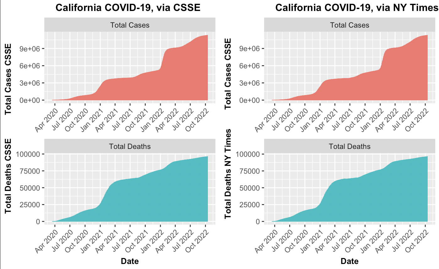
- Comparing the total cases and Deaths between the NY Times and CSSE for California: The NY Times and CSSE each produced their own aggreggated reports on total cases and total deaths. The cumulative point of the project was comparing data sets on COVID-19 from the Center for NY Times and Systems Science and Engineering (CSSE) from years 2020 to 2022. Before comparing the two data sets, each was explored to find trends and verify accuracy. Tidying the CSSE dataset involved transforing the date information from a wide format to a long format and consolidating the date columns into one. Furthermore, the date columns was stored as a character which required convertion to a date type using the as.Date() function. This issue was not immediately apparent, but became an error when attempting to plot. The inability to use scale.x.date() indicated that the column was incorrect. The final visualization of the two datasets were strikingly similar, despite opting for the free scale y-axis. The legend was ommitted to and instead subplot titles were the guiding reference to minimize clutter and emphasize similarity between plots.
{r, part3_question1, echo=TRUE}
## Load in CA state info from part 2
counties_combined <- rbind(us_counties_2020, us_counties_2021, us_counties_2022)

california_only <- counties_combined %>%
  filter(state == "California")

## the cases and deaths total for CA

california_Times <- california_only %>%
  group_by(date) %>%
  summarise(
    deaths_CA = sum(deaths),
    cases_CA = sum(cases)
  )

as_tibble(california_Times)

## 1) Now find the CA data reported by the CSSE cases and deaths
## try to rbind them together but they have different variables numbers
## also, they have the cases spread across variables instead of a date and cases
## columns so use pivot_longer() first to tidy then combine the data sets

csse_cases_tidy <- csse_us_cases %>%
  pivot_longer(
    cols = 12:1049,
    names_to = "date",
    values_to = "cases"
  )

as_tibble(csse_cases_tidy)

csse_deaths_tidy <- csse_us_deaths %>%
  pivot_longer(
    cols = 12:1049,
    names_to = "date",
    values_to = "deaths"
  )
csse_deaths_tidy <- csse_deaths_tidy[-c(12)]

as_tibble(csse_deaths_tidy)

## 2) now combine the two using a left join
csse_combined <- right_join(
  csse_cases_tidy,
  csse_deaths_tidy,
  by = c("UID", "iso2", "iso3", "code3", "FIPS", "Admin2", "Province_State",
         "Country_Region", "Lat", "Long_", "Combined_Key", "date")
)

## 3) the date is not actually a date class, which means it won't work with
## functions that we need, use as.date() and specify the format

csse_combined$date <- as.Date(csse_combined$date, "%m/%d/%y")

## 4) now filter for California info, the other data set starts on 2020-01-25
csse_CA <- csse_combined %>%
  filter(Province_State == "California") %>%
  group_by(date) %>%
  summarise(
    cases = sum(cases),
    deaths = sum(deaths)
  ) %>%
  filter(date >= "2020-01-25") %>%
  arrange(date) %>%
  rename(
    csse_cases = 2,
    csse_deaths = 3
  )

## 5) now create a visualization
## start with CA dataset from NY Times

CA_plot_data_Times <- california_Times %>%
  pivot_longer(
    cols = 2:3,
    names_to = "type",
    values_to = "number_reported"
  ) %>%
  filter(
    date != "2022-11-24"
  )

CA_plot_data_CSSE <- csse_CA %>%
  pivot_longer(
    cols = 2:3,
    names_to = "type",
    values_to = "number_reported"
  )

## 6) variables to label the plots for NY TIMES

variable_names <- list(
  "cases_CA" = "Total Cases" ,
  "deaths_CA" = "Total Deaths"
)

variable_labeller <- function(variable, value){
  return(variable_names[value])
}

## 6b) variables to label the plots for CSSE
variable_names2 <- list(
  "csse_cases" = "Total Cases" ,
  "csse_deaths" = "Total Deaths"
)

variable_labeller2 <- function(variable, value){
  return(variable_names2[value])}

## 7) PLOT FOR NY TIMES DATA
CA_plot_Times <- CA_plot_data_Times %>% ggplot(
  aes(x = date,
      y = number_reported,
      fill = type,
      color = type)) +
         geom_bar(stat = 'identity',
                  size = .2, na.rm = TRUE)+
 facet_wrap(~ type,
             nrow =  2,
             scales = "free",
             labeller = variable_labeller) +
  labs(x = "Date",
       y = "Total Deaths NY Times        Total Cases CSSE",
       fill = "Type Reported:") +
  theme(title = element_text(face = "bold",
                             size = 10),
        axis.text.x = element_text(angle = 45, hjust = 1),
        axis.title.y = element_text(face = "bold"),
        axis.title.x = element_text(face = "bold"),
        legend.position = "none") +
  ggplot2::labs(title =
              "    California COVID-19, via NY Times") +
  scale_fill_discrete(labels = c("Cases", "Deaths")) +
  scale_x_date(date_labels = "%b %Y",
               date_breaks = "3 months",
               limits = as.Date(c('2020-03-15','2022-10-15')))

## 8) PLOT FOR CSSE DATA
CA_plot_CSSE <- CA_plot_data_CSSE %>% ggplot(
  aes(x = date,
      y = number_reported,
      fill = type,
      color = type)) +
         geom_bar(stat = 'identity',
                  size = .2, na.rm = TRUE)+
 facet_wrap(~ type,
             nrow =  2,
             scales = "free",
             labeller = variable_labeller2) +
  labs(x = "Date",
       y = "Total Deaths CSSE          Total Cases CSSE",
       fill = "Type Reported:") +
  theme(title = element_text(face = "bold",
                             size = 10),
        axis.text.x = element_text(angle = 45, hjust = 1),
        axis.title.y = element_text(face = "bold"),
        axis.title.x = element_text(face = "bold"),
        legend.position = "none") +
  ggplot2::labs(title =
              "    California COVID-19, via CSSE") +
  scale_fill_discrete(labels = c("Cases", "Deaths")) +
  scale_x_date(date_labels = "%b %Y",
               date_breaks = "3 months",
               limits = as.Date(c('2020-03-15','2022-10-15')))
## 9_ plot them side by side for comparison
plot_grid(CA_plot_CSSE, CA_plot_Times)
Dataset Sources: NY Times 2020 COVID NY Times (“https://raw.githubusercontent.com/nytimes/covid-19-data/master/us-counties-2020.csv”) 2021 COVID NY Times (“https://raw.githubusercontent.com/nytimes/covid-19-data/master/us-counties-2021.csv”) 2022 COVID NY Times(“https://raw.githubusercontent.com/nytimes/covid-19-data/master/us-counties-2022.csv”) CSSE John Hopkins CSSE Deaths “https://raw.githubusercontent.com/CSSEGISandData/COVID-19/master/csse_covid_19_data/csse_covid_19_time_series/time_series_covid19_deaths_global.csv CSSE Cases “https://raw.githubusercontent.com/CSSEGISandData/COVID-19/master/csse_covid_19_data/csse_covid_19_time_series/time_series_covid19_confirmed_global.csv”
