Speed Dating Dataset Visualization
The questions:
- How do men and women rate themselves versus how their dates rate them?
- Which attributes had the highest correlation to a participant’s popularity rate?
This dataset was the result of a speed dating experiment conducted by Columbia professors Ray Fisman and Sheena Iyengar. The dataset was lengthy and provided a lot of quantitative insights on how people percieve themselves and others in a dating context. The dataset was originally a 120x8379 data set and cleaning required referencing the accompanying document. The participants were asked many questions, but this project focuses on the attributes, not the hobbies and backgrounds.
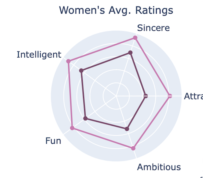
1. Perception versus Reality of Self by Gender
The methodology focused on contrasting the self-perception versus others’ perception of speed dating participants, differentiated by gender. Participants were asked to rate themselves on a scale from 1 - 10 on 5 attributes—attraction, sincerity, intelligence, fun, and ambition. Then their dates rated them on the same 5 attributes. Average self-scores for each gender were computed and rounded for precision. Parallelly, the average scores received from others on these attributes were calculated, thereby establishing a dataset reflective of external perceptions. The same was done for males then the two datasets were merged. To visualize the findings, the data was presented using radar charts, enabling a multidimensional comparison. Custom hex colors were applied to differentiate between self and others’ ratings within the charts for men and women.
Key Observations:
• Men and Women on average rated themselves lower than their dates did for each attribute. Maybe, we should think more highly of ourselves!
• Despite women rating themselves higher for each attribute on average, except for intelligence, the contrast between self and reality demonstrates that each gender may have underrated their own attributes
• The radar chart had to be scaled down from the 1 - 10 to 5 - 10 in order to provide meaningful contrast betwen the self and reality scores visually
Hover over the radars to explore the contrast
Cleaning the dataset
# Clean
# (1) Drop all columns that end in 2 or 3, follow ups
# iterate through columns in the dateframe dates and checks (by inverting first) if the column starts with 2 or 3
use_cols = [col for col in dates.columns if not (col[::-1].startswith('2') or col[::-1].startswith('3') )]
dates = dates[use_cols] # after selecting the columns, set as the columns to work with
# dates.shape # understand data

# (2) Create list of 5 attributes considered and ranked by the participants
# Find the particpants' response to how their percieve their own attributes?
attributes = ['attr', 'sinc', 'intel', 'fun', 'amb']
personal_m_cols = [attribute + '3_1' for attribute in attributes] # generate modified attribute names, append '3_1'
# the suffix 3_1 is the participant's response to their own attributes

# (3) Find the average score each gender provided for self score
gender_perception_score = (dates[['gender', 'iid'] + personal_m_cols].
 # select for the columns gender and iid and the columns listed from previous list
 groupby('iid'). # group by iid
 max().
 groupby('gender'). # group by gender and find the average each gender rated themselves
 mean().round(2))

# (4) Create list of scores from others
attributes = ['attr', 'sinc', 'intel', 'fun', 'amb']
others_ratings_name = [attribute + '_o' for attribute in attributes] # generate modified attribute names, append '_o'

# (5) Find average score each gender recieved
gender_score_reality = (dates[['gender','iid'] + others_ratings_name].
 groupby('iid').max().
 groupby('gender').mean().round(2))

# (6) Merge the two df's together
perception_reality_gender = gender_perception_score.merge(gender_score_reality, how='left', on='gender')
perception_reality_gender
Visualize the different averages
# (7) Visualise to see if there is a difference between self score and given score
# Rename columns and rows
new_cols = {
    'attr3_1':'Attractive Self',
    'sinc3_1':'Sincere Self',
    'intel3_1':'Intelligent Self',
    'fun3_1':'Fun Self',
    'amb3_1':'Ambitious Self',
    'attr_o':'Attractive Other',
    'sinc_o':'Sincere Other',
    'intel_o':'Intelligent Other',
    'fun_o':'Fun Other',
    'amb_o': 'Ambitious Other'
    }
perception_reality_gender.rename(columns=new_cols,inplace=True) # apply the dictionary changes
gender_avgs = perception_reality_gender.copy() # the name was too long

# (7B) Initialize subplot figure, 1x2
fig = make_subplots(
    rows=1, cols=2,
    subplot_titles=('Women\'s Avg. Ratings', 'Men\'s Avg. Ratings'),  # subplot titles
    specs=[[{'type': 'polar'}, {'type': 'polar'}]],
    horizontal_spacing=0.12,
    vertical_spacing=0.2 # Space between the subplots
)

# (7C) Function to add radar chart traces for each gender
def add_gender_radar_trace(fig, df, gender, gender_name, col_num, colors):
    self_ratings = df.loc[gender, [col for col in df.columns if 'Self' in col]].values.tolist()
    other_ratings = df.loc[gender, [col for col in df.columns if 'Other' in col]].values.tolist()

    self_ratings += self_ratings[:1]
    other_ratings += other_ratings[:1]
    categories_circular = categories + [categories[0]]

    fig.add_trace(go.Scatterpolar(
        r=self_ratings,
        theta=categories_circular,
        fill=None,
        name=f'{gender_name} Self',
        line=dict(color=colors['Self']),
        subplot=f'polar{col_num}'
    ))

    fig.add_trace(go.Scatterpolar(
        r=other_ratings,
        theta=categories_circular,
        fill=None,
        name=f'{gender_name} Others',
        line=dict(color=colors['Others']),
        subplot=f'polar{col_num}'
    ))

# Define categories (attributes) without 'Self' or 'Others'
categories = ['Attractive', 'Sincere', 'Intelligent', 'Fun', 'Ambitious']

# Custom hex colors for the traces
colors_women = {'Self': '#7E466A', 'Others': '#d375b2'}
colors_men = {'Self': '#467e7c', 'Others': '#75d3d0'}

# (7D) Add traces to your subplots here
add_gender_radar_trace(fig, gender_avgs, 0, 'Women', 1, colors_women)
add_gender_radar_trace(fig, gender_avgs, 1, 'Men', 2, colors_men)
Plot adjustments: radar labels, ticks, colors, legend, and annotation
# (7E) Layout adjustments
fig.update_layout(
    margin=dict(t=100),
    title_text='<b>How Men and Women Rated Themselves</b> vs <b>How Their Dates Rated Them</b>', # main title for both subplots
    title_x=0.5, # center the title
    plot_bgcolor='rgba(224, 218, 199, 1)',
    polar1=dict(
        radialaxis=dict(
            visible=True,
            showticklabels=False, # remove tick labels
            range=[5, 10] # change range, no scores under 5
        )
    ),
    polar2=dict( # men's spider chart
        radialaxis=dict(
            visible=True,
            showticklabels=False,
            range=[5, 10],
        )
    ),
    showlegend=True,
    legend=dict(
        font_size=13,
        orientation="v",
        yanchor="bottom",
        y=0.05,
        xanchor="center",
        x=0.5
    ),
    annotations=[ # Make adjustments to each subplot title
        dict(
            text='Women\'s Avg. Ratings',
            x=0.22,  # Adjust x-position
            y=1.1,   # Adjust y-position
            xref='paper',
            yref='paper',
            showarrow=False,
            font=dict(size=14)
        ),
        dict(
            text='Men\'s Avg. Ratings',
            x=0.79,  # Adjust x-position for better placement
            y=1.1,   # Adjust y-position for better placement
            xref='paper',
            yref='paper',
            showarrow=False,
            font=dict(size=14)
        )
    ]
)
# Add an annotation to the whole figure
fig.add_annotation(
    dict(
        text="Participants of a speed dating experiment rated themselves<br>"
        "on 5 attributes then their dates rated them too. On a scale <br>"
        "from 0 to 10, each gender recieved higher scores on average<br>"
        "than they rated themseleves on average", # Annotation text
        xref="paper", yref="paper",
        x=0.5, y=-0.25, showarrow=False,
        font=dict(size=10)  # Annotation font size (adjust as needed)
    )
)

# Show the figure
fig.show()
2. Which attributes show the highest correlation to a participant’s popularity rate?
Answering this question required to parts, the first was quantifying a participant’s popularity rate and the second was creating a correlation matrix to plot.
The process began with grouping the data by participant identifier and aggregating the number of rounds they attended, the total affirmative decisions received (‘dec_o’), the decisions they made (‘dec’), and the matches they achieved (‘match’)—where a match indicated mutual affirmative decisions. Three different ratings were measures; ‘Popularity Rate’ indicated the frequency of participants being chosen by their dates, ‘Matches’ represented the rate of mutual interest per round, and ‘Reciprocated’ reflected the proportion of mutual interest when the participant had also expressed interest.
Unlike the self scored attributes, the scores from dates included a 6th attribute-shared interests-on which participants were evaluated by others. A correlation analysis was then conducted to discern the influence of each attribute on a participant’s popularity rate. The subsequent correlation dataframe was plotted utilizing a heatmap to best demonstrate a visual relationship between each attribute and popularity.
Key Observations: • The strongest correlation to popularity was the attribute ‘attractive’
• Although all attributes had a postive correlation, sincerity and intelligence presented notably lower correlations to popularity rate
• Including shared interests in the analysis provided a more holistic picture of what contributed to a participant’s popularity due to its above average correlation
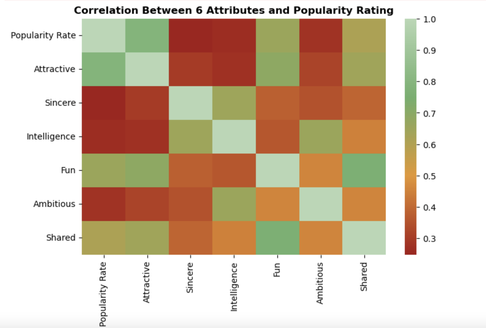
Correlation heatmap of 6 attributes
# (1) Finding how succesful participants were
participants = dates.groupby(by='iid').agg({ # aggregates computed based on:
            'round' : np.max, # round is the same in each row
            'dec_o' : np.sum, # sum the number of "yes" they got
            'dec': np.sum,
            'match' : np.sum # sum of matches 1 = yes, 0 = no
        }).reset_index()

participants = participants.assign( # note yes = 1, no = 0
    pop_rate = participants.dec_o / participants['round'], # date's decision to date participant again / total rounds
    match_rate = participants.match / participants['round'], # number of matches (both said yes) / total rounds
    recip_rate = participants.match / participants.dec # number of matches / number of people they said yes to
)

# (2) Get the 6th attribute that participants where rated on
attributes6 = ['attr', 'sinc', 'intel', 'fun', 'amb','shar']

# (3) Merge the rate results with the ratings from others
others_ratings = dates[['iid'] + [att + '_o' for att in attributes6]].groupby(by='iid').mean().reset_index() # _o is score from others
participants = participants.merge(others_ratings, how='left', on='iid') # merge results to the df profiles
participants

participants.rename(columns={'pop_rate':'Popularity Rate',
                             'match_rate':'Matches',
                             'recip_rate':'Reciprocated',
                             'attr_o':'Attractive',
                             'sinc_o':'Sincere',
                             'intel_o':'Intelligence',
                             'fun_o':'Fun',
                             'amb_o':'Ambitious',
                             'shar_o':'Shared'}, inplace=True)


# (5) Find the correlation that each attribute has on a participant's popularity rate
# use the attribute rating from other people
correlation_matrix = participants[['Popularity Rate','Attractive','Sincere','Intelligence','Fun','Ambitious','Shared']].corr()


# (6) Create custom colormap
custom_colors = ["#a61717", "#E7962a", "#6aaf69", "#b5d7b4"]  # Replace with your own hex values
cmap = LinearSegmentedColormap.from_list("custom_cmap", custom_colors)

# Creating a heatmap
plt.figure(figsize=(8, 5))
heatmap = sns.heatmap(correlation_matrix,
                      annot=False,
                      fmt='.2f',
                      cmap=cmap)
plt.title('Correlation Between 6 Attributes and Participant\'s Ratings',
          fontweight='bold',
          fontsize=12)
plt.show()
Data Sources:
Speed Dating CSV and DOC
Match and questionnaire data from speed dating experiment run by Columbia professors Ray Fisman and Sheena Iyengar