Measuring Military Strength:
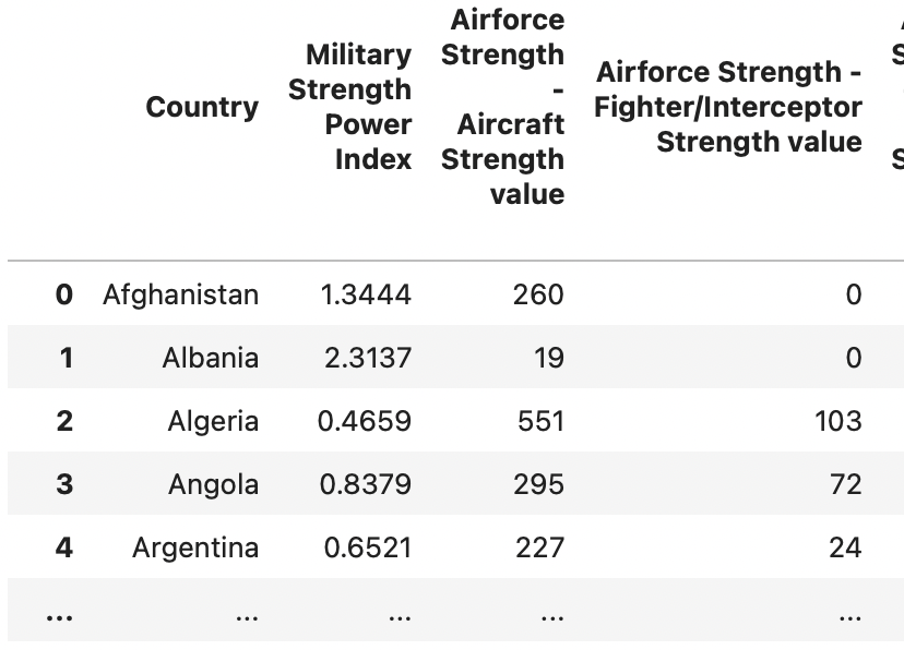
For the purpose of my analysis, I selected a dataset from Kaggle that evaluates the strength of 133 countries’ militaries. The dataset took into account 29 different variables and provided a score for each country based on the variables. The score assigned was called the Military Strength Power Index (MSPI). The variables considered in determining a military’s strength included factors like military spending, airforce strength, navy strength, and land strength. Originally the dataset was 138x60, but after cleaning and filtering, my analysis was conducted on a 133x31. Initial dataset cleaning involved collapsing multi-index columns, addressing null values, and removing duplicate columns. As my analysis progressed, new columns were calculated such as Defense spending per capita, MSPI based GPA, Random Forest (RF) based GPA, and letter grade score.
1. What is the linear relationship between a country’s defense spending and its military strength ranking?
My visualization shows an interactive scatterplot utilizing Plotly Express. A linear regression line was calculated to understand the relationship between a country’s defense spending and its strength score. The visualization was tricky to plot for two reasons the disparity in axes scales and the inverse nature of the Military Strength Power Index (score of 0.00 is perfect and score of 5+ is poor). To address the large range in military spending among the countries, I utilized a logarithmic scale along the x-axis. Next, to address the inverse nature of the index score system, I inverted the y-axis to better match what is intuitive to most people, a higher place on the graph correlates to a stronger military. The decision to invert the y-axis presented a subsequent challenge in a negative slope, but treating the equation as an absolute value or multiplying by negative one displays a slope formula aligning with the increasing slope in the plot. Contextualization elements were added through the use of an interactive hover element and a calculation of defense spending per capita displayed on a gradient bar.
Key observations from the visualization:
• The positive linear relationship between a military’s strength and its defense spending demonstrates what most people would say is intuitive, however the equation line shows that countries spending past $40 billion did not vary greatly on the index score, and the regression line demonstrates so arithmetically
• The U.S. is a defense spending anomaly even on a logarithmic scale
• The countries that scored similiarly to the U.S. like China actually displayed low defense spending per capita
Hover over points and explore the relationship below:

CODE FOR PLOT 1:
Regression line and plot set up
########################################################
# INTERACTIVE LINEAR REGRESSION GRAPH:

# (1) Calculate the line of best fit on the log of x and linear y
log_x = np.log(mil_df_full['Finances - defense spending budget value'])
slope, intercept = np.polyfit(log_x, mil_df_full['Military Strength Power Index'], 1)

# (2) Create the best fit line points
x_range = np.linspace(log_x.min(), log_x.max(), 100)
y_range = slope * x_range + intercept
display_slope = -slope # remember to make multiple slope by -1, but only for the display not for the plotting

# (3) Plot the interactive scatter plot with Plotly Express
fig = px.scatter(mil_df_full, # dataframe
                 x='Finances - defense spending budget value', # x-axis used
                 y='Military Strength Power Index', # y-axis used
                 hover_name='Country',  # sets the hover information to the country name
                 color='Defense Spending Per Capita',  # color scale based on 'Defense Spending Per Capita'
                 log_x=True,  # set the x-axis to a logarithmic scale to address range
                 title='Correlation between Defense Spending and Military Strength by Country (Log Scale)', # label changed below
                 labels={'Finances - defense spending budget value': '<b>Defense Spending</b><br> (USD $)', # <b> bold and linebreak
                         'Military Strength Power Index': '<b>Military Strength</b><br>(Power Index)',
                         'Defense Spending Per Capita': 'Defense Spending Per Capita'})

# (4) Scaling our plot and fit
# Format the regression line equation as a string
equation_text_for_legend = f"y = {display_slope:.2e} * log(x) + {intercept:.2f}" # call the display slope for the eq.

# Add the regression line to plot
fig.add_traces(go.Scatter(x=np.exp(x_range), y=y_range, mode='lines', name= f'Best Fit Line: {equation_text_for_legend}'))

# Invert the y-axis
fig.update_yaxes(autorange='reversed')
Visual Adjustments: legend, title, gradient bar, annotation
# (5) Visual Adjustments
# Legend Updates
fig.update_layout(
    legend=dict(
        yanchor="top",
        y=0.2,
        xanchor="left",
        x=.61
    ))
fig.update_layout(
    title={
        'text': "<b>Relationship between Defense Spending and Military Strength by Country</b><br>(Log Scale)",
        'y':0.9,
        'x':0.5,
        'xanchor': 'center',
        'yanchor': 'top',
    }
)

# Gradient Bar Updates
fig.update_layout(
    coloraxis_colorbar=dict(
        title='Defense Spending Per Capita',
        tickformat=',',
        title_side='top',
        tickprefix='$',
        tickfont=dict(size=9)
    )
)

# Annotation Updates
fig.add_annotation(
    text="Notes:<br>"
    "• y-axis was inverted because a lower index score indicates a stronger military<br>"
    "• log scale utilized due to large range of defense budget relative to index scores<br>"
    "• best fit line uses linear regression to quanitfy relationship and slope is inverted in the display",
    xref="paper", yref="paper",
    x=1.2, y=-.4, showarrow=False,
    font=dict(size=9),
    bgcolor="lightyellow",
    bordercolor="black",
    borderwidth=1
)

# (6) Show the figure
fig.show()
2. What would the Military Strength Power Index rating system look like on a 4.0 scale?
While the Military Strength Power Index does seem to align with the common understandings of world military power rankings, the scale is not intuitive and it doesn’t really mean anything. The methodology for this analysis involved two different approaches to the problem. The first was a standardization of the MSPI, followed by an adjustment using an offset, and then an inversion in order to mimic an academix 4.0 GPA scale. The second approach, utilized a RF model to predict the scaled MSPI based on the 29 variables. The model underwent validation through a training-testing split, and its performance was measured using the mean squared error metric, which demonstrated a low score.
The two visualizations and observations:
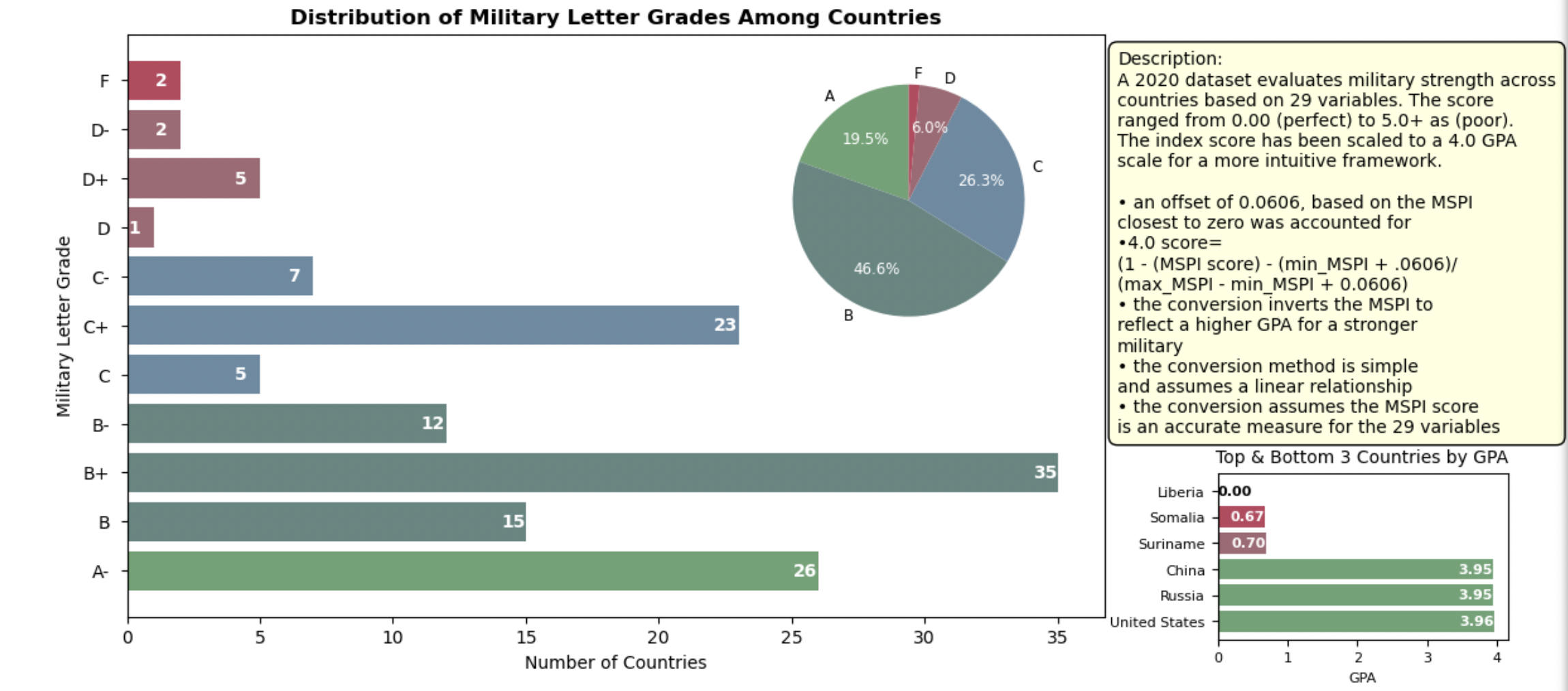
• The first plot demonstrates the grades assigned to the 133 countries after cleaning the data and rescaling each MSPI score. Compared to the previous scatterplot, this 4.0 scale method provides viewers a point of reference to understanding how the evaluation of strength and subsequent rankings of strength vary among countries. No country had a perfect 4.0 because no country has a perfect 0.0 index score, therefore I omitted the 4.0, A and A+ from the y-axis.
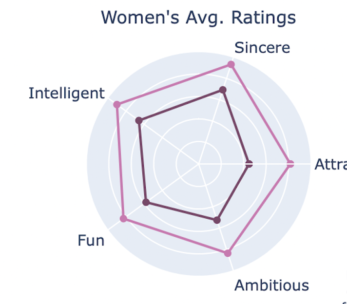
• The second plot applys an interactive radar plot to understanding how the 29 variables were weighed in deciding a country’s GPA by the two different methods. The 29 variables were categorized into 5 main categories that best encapsulated the principal domains and took the average pre-normalized score then divided it by the number of columns inputted as variables. The simplification of the variables provides a more digestible visualization that does not overtly skew or mislead the viewer. The template ‘plotly_dark’ was selected to contrast the differences due to the nature of the small scale.

Hover over points and compare the methods below
Code for plots 2 and 3
Rescaling MSPI
###############################################################
# WHAT IF WE RESCALE OUR THE INDEX TO FIT A 4.0 SCALE, SOMETHING PEOPLE ARE FAMILIAR WITH?
# A 4.0 scale break down
# a class is given a score/grade from 0 to 4.0
# then the class is multiplied by the credits it is worth = grade points
# the total of all the grade points is divided by the total credit hours
# the score is translate into a grade

# (1) Converting to 4.0
# (1A) Scaling Prep
mil_numeric = mil_df_full.copy()
mil_numeric = mil_numeric.iloc[:,1:31]
mil_complt = mil_df_full.copy()
mil_scaled = mil_numeric.copy()

# (2A) Scaling the MSPI
min_MSPI = mil_numeric['Military Strength Power Index'].min()
max_MSPI = mil_numeric['Military Strength Power Index'].max()

offset = 0.0606  # Adjust this offset as needed to prevent a 4.0 score for the lowest MSPI
scaled_scores = 4.0 * (1 - (mil_numeric['Military Strength Power Index'] - min_MSPI + offset) / (max_MSPI - min_MSPI + offset))
# Ensure scores are within the 0 to 4.0 range
mil_scaled['Scaled Military Strength Power Index'] = scaled_scores.clip(upper=4.0, lower=0)

# (3A) Scaling for all other variables
for col in mil_numeric.columns:
    if col not in ['Military Strength Power Index', 'Scaled Military Strength Power Index']:
        min_val = mil_numeric[col].min() # find the max
        max_val = mil_numeric[col].max() # find the min
        mil_scaled[col] = (mil_numeric[col] - min_val) * 4.0 / (max_val - min_val)

# print(mil_scaled.sort_values('Military Strength Power Index'))

###########################################################################
# CORRELATIONS = WEIGHT
# (1B) Determine correlations of each variable
# (2B) Correlations Prep
mil_correlations = mil_df_full.copy()
mil_correlations = mil_correlations.iloc[:,1:31]

# (3B) Correlation
correlation_matrix = mil_correlations.corr()
# Extract correlations with the MSPI, excluding the MSPI itself
mspi_correlations = correlation_matrix['Military Strength Power Index'].drop('Military Strength Power Index')

# (4B) Correlation values
# Use absolute values to focus on the strength of the relationship, regardless of direction
weights = mspi_correlations.abs()

# (5B) Normalize the correlation
# Optionally, normalize the weights to sum to 1
normalized_weights = weights / weights.sum()

# Display the normalized weights, which now act like "credits"
# print(normalized_weights.sum())

# OBSERVATIONS:
# we tried to take these 'weights' that were meant to be equivalent to the number of credit hours a class is worth, but
# it did not work, it is oversimplified
# The resulting GPA calculation that came from the sum of the 'weight'*grade / total 'weights' was much lower
# than the scaled GPA we calculated
# therefore, I have removed that attempt and skipped past a second attempt which was also removed
# involving predicting the MSPI 'OLS regression model' on an oversimplified df test which
# likewise had a large error in both directions
# the next prediction model below is the best attempt among the 3 in predicting
# the MSPI based on the variables
Random Forest rescale
############   RF APPLICATION   ############################################
# (1C) Prediction prep
# preapre the features = X and the target = Y for the model
# exclude the 'Country' column and original MSPI column
mil_complt_var = mil_complt.iloc[:,0:31]
X = mil_complt.iloc[:,2:31]
Y = mil_scaled['Scaled Military Strength Power Index']

# (2C) Define training and testing sets
# this is for model validation
X_train, X_test, Y_train, Y_test = train_test_split(X, Y, test_size=0.2, random_state=42)

# (3C) Utilize and train the random forest model using our training data
model_rf = RandomForestRegressor(n_estimators=100, random_state=42)
model_rf.fit(X_train, Y_train)

# (4C) Predict from our trained model
Y_pred = model_rf.predict(X_test)

# (5C) Determine the mean squared error to determine performance, low values are good
mse_rf = mean_squared_error(Y_test, Y_pred)
# print("random forest MSE on Scaled MSPI:", mse_rf)

# (6C) Apply our prediction forthe Scaled MSPI using the random forest model for the whole dataframe
# assign the results in a new columns for easy comparing
mil_scaled['Predicted Scaled MSPI'] = model_rf.predict(X)  # Ensure X is correctly defined as your feature set

# (7C) Compare results
# Bring columns forward
mil_GPAs = mil_scaled.copy() # make sure to use copy not a view
columns_slct = ['Scaled Military Strength Power Index', 'Predicted Scaled MSPI'] # select the cols to bring forward
other_cols = [col for col in mil_scaled.columns if col not in columns_slct] # iterate through the other columns
mil_GPAs = mil_GPAs[columns_slct + other_cols] # apply the change
mil_GPAs.head()

# Add back country column
mil_GPAs['Country'] = mil_df_full['Country'] # select country back from a df that has it
# bring the column to the front
columns_GPAs = mil_GPAs.columns.tolist() # make a list of the columns
columns_GPAs = [columns_GPAs[-1]] + columns_GPAs[:-1] # change the order, move last to the front
mil_GPAs = mil_GPAs[columns_GPAs] # reindex

mil_GPAs.head() # Verify work

# OBSERVATIONS:
# The results of this model are much more accurate than our previous attempts
# the model could be further refined, but this accuracy should be satisfactory for the
# type of analysis we want to employ with this prediction model
Visualizing the different methods
############   VISUALIZATION TIME   #####################################
# WHAT COUNTRIES GOT AN A,B,C... with the scaled_GPA
# (1D) Map the GPA : Letter Grade dictionary

# LETTER GRADE OF SCALED
# Define the function that maps GPA to letter grades based on ranges
def get_letter_grade(gpa):
    if gpa == 4.0:
        return 'A'
    elif 3.67 < gpa <= 4.0:
        return 'A-'
    elif 3.33 < gpa <= 3.67:
        return 'B+'
    elif 3.0 < gpa <= 3.33:
        return 'B'
    elif 2.67 < gpa <= 3.0:
        return 'B-'
    elif 2.33 < gpa <= 2.67:
        return 'C+'
    elif 2.0 < gpa <= 2.33:
        return 'C'
    elif 1.67 < gpa <= 2.0:
        return 'C-'
    elif 1.33 < gpa <= 1.67:
        return 'D+'
    elif 1.0 < gpa <= 1.33:
        return 'D'
    elif 0.67 < gpa <= 1.0:
        return 'D-'
    elif gpa <= 0.67:
        return 'F'

# Apply the get_letter_grade function to each GPA in mil_GPAs to create a new 'Letter Grade' column
mil_GPAs['Letter Grade'] = mil_GPAs['Scaled Military Strength Power Index'].apply(get_letter_grade)
# print(mil_GPAs[['Country', 'Scaled Military Strength Power Index', 'Letter Grade']].head(10)) verify work

# (2D) Count the frequency of each letter grade
grade_counts = mil_GPAs['Letter Grade'].value_counts().sort_index()

# (3D) Create a color map for the grades as a function
# Define a function to get the color based on the grade
def get_color(grade): # only check what the grade starts in order to group and not overwhelm with colors
    if grade.startswith('A'):
        return '#68a374'  # A grades, custom hex values
    elif grade.startswith('B'):
        return '#628681'  # B grades
    elif grade.startswith('C'):
        return '#688ba3'  # C grades
    elif grade.startswith('D'):
        return '#a36874'  # D grades
    else:  # Assuming all other grades are F
        return '#BD455E'  # F grades

# Map each grade to its color using get_color
grade_colors = grade_counts.index.map(get_color)

# (4D) Bar chart
fig, ax = plt.subplots( figsize=(10, 6))  # set subplot
bars = plt.barh(grade_counts.index, grade_counts.values, color = grade_colors) # barh horizontal, define our bars axes, set to color map
### Bar adjustments
ax.bar_label(bars, padding=-14.3, color='white', fontsize=10, label_type = 'edge', fontweight='bold')
### Y-ticklabels adjustments
ax.yaxis.set_tick_params(pad=6.2) # align y-axis tick labels to the left
### Labels for bar chart
plt.title('Distribution of Military Letter Grades Among Countries', fontweight='bold')
plt.xlabel('Number of Countries')
plt.ylabel('Military Letter Grade')
plt.xticks(rotation=0)  # Keep the letter grade labels horizontal for readability

# (5D) PIE CHART WITHIN THE SAME
grouped_grades = grade_counts.groupby(lambda x: x[0]).sum() # aggregates based on first letter
### Define the position for the pie chart
pie_ax = fig.add_axes([0.63, 0.42, 0.23, 0.48])  # align in top right, don't block other graph
### Plot the pie chart in the inset axes
wedges, texts, autotexts = pie_ax.pie(grouped_grades.values, # specify pie charts
                                      colors=[get_color(grade) for grade in grouped_grades.index], # based on our groups
                                      startangle=90, # determines start angle
                                      labels=grouped_grades.index,
                                      autopct='%1.1f%%',
                                      pctdistance=0.65,
                                     textprops={'fontsize': 8.5})

### Make the autopct (percentage) labels white for better readability
for autotext in autotexts:
    autotext.set_color('white')
### Hide the percentage for 'F' by setting its visibility to False, prevent clutter
for autotext in autotexts:
    if autotext.get_text() == '1.5%': #the value muted
        autotext.set_visible(False)

### This graph needs a lot of description
plt.annotate('Description:'
            '\nA 2020 dataset evaluates military strength across\n'
             "countries based on 29 variables. The score\n"
             'ranged from 0.00 (perfect) to 5.0+ as (poor).\n'
             'The index score has been scaled to a 4.0 GPA\n'
             'scale for a more intuitive framework.\n'
             '\n• an offset of 0.0606, based on the MSPI\n'
             'closest to zero was accounted for\n'
             '•4.0 score=\n'
             '(1 - (MSPI score) - (min_MSPI + .0606)/\n'
             '(max_MSPI - min_MSPI + 0.0606)\n'
             '• the conversion inverts the MSPI to\n'
             'reflect a higher GPA for a stronger\n'
             'military\n'
             '• the conversion method is simple\n'
             'and assumes a linear relationship\n'
             '• the conversion assumes the MSPI score\n'
             'is an accurate measure for the 29 variables',
            xy=(0,0),
            xytext=(1.8,-2.0),
            bbox=dict(boxstyle='round,pad=0.5', facecolor='lightyellow', edgecolor='black'))


# Observations
# The pros of the graph: the custom hex colors, the use of counts compared to %, the use of a scale understood easily
# The cons of the graph: leaves a lot of questions, what countries? based on what? when?

##################################################################

# Sort the DataFrame by 'Scaled Military Strength Power Index' to get top and bottom countries
sorted_mil_GPAs = mil_GPAs.sort_values(by='Scaled Military Strength Power Index', ascending=False)

# Get top 3 and bottom 3 countries
top_3_countries = sorted_mil_GPAs.head(3)
bottom_3_countries = sorted_mil_GPAs.tail(3)

# Combine top 3 and bottom 3 for plotting
top_bottom_countries = pd.concat([top_3_countries, bottom_3_countries])
# Define the position for the new subplot (adjust these coordinates as needed)
gpa_ax = fig.add_axes([0.99, 0.08, 0.23, 0.22])  # Placement might need adjustment

def get_color(grade):
    color_map = {
        'A': '#68a374',
        'B': '#628681',
        'C': '#688ba3',
        'D': '#a36874',
        'F': '#BD455E'
    }
    return color_map.get(grade[0], '#BD455E')  # Default to 'F' color

# Assuming 'top_bottom_countries' DataFrame exists and has a 'Letter Grade' column
# Generate 'bar_colors' list using the 'get_color' function for each row's grade
bar_colors = [get_color(grade) for grade in top_bottom_countries['Letter Grade']]

# Plotting top 3 and bottom 3 countries' GPA
bars = gpa_ax.barh(top_bottom_countries['Country'],
                   top_bottom_countries['Scaled Military Strength Power Index'],
                   color = bar_colors)

# Setting titles and labels with customization
gpa_ax.set_title('Top & Bottom 3 Countries by GPA', fontsize=10)
gpa_ax.set_xlabel('GPA', fontsize=8)
gpa_ax.tick_params(axis='both', which='major', labelsize=8)

# Iterate through the DataFrame and bars simultaneously
for bar, (index, row) in zip(bars, top_bottom_countries.iterrows()):
    label = f"{row['Scaled Military Strength Power Index']:.2f}"  # format the GPA with two decimal places to differentiate
    if row['Country'] != 'Liberia': # for all countries except Liberia, because liberia's GPA is 0
        gpa_ax.text(bar.get_width(), bar.get_y() + bar.get_height() / 2, label,
                    va='center', ha='right', color='white', fontsize=8, fontweight='bold',
                    clip_on=True)  # clip on the bar
    else: # Only place the label outside for Liberia
        gpa_ax.text(bar.get_width(), bar.get_y() + bar.get_height() / 2, label,
                    va='center', ha='left', color='black', fontsize=8, fontweight='bold',
                    clip_on=True)

plt.show()

# Observations:
# This is an interesting way to think of the scale as opposed to the MSPI index value that didn't
# mean anything
# This shows that most countries have a high scoring Military
# Obviously, this doesn't account for features and factors that count negatively against a country's militaryb
# like suicide rate and low morale would count heavily against a military's strength
Radar plot
# Function that calculates the average of set columns and sets results in new column
def agg_to_category(df, column_list, category_name): # accepts a df, list, and new name
    df[category_name] = df[column_list].apply(pd.to_numeric, errors='coerce').mean(axis=1) # ensure numeric then calc. avg.
    return df
# All the lists
columns_to_airforce = ['Airforce Strength - Aircraft Strength value',
 'Airforce Strength - Fighter/Interceptor Strength value',
 'Airforce Strength - Attack Aircraft Strength value',
 'Airforce Strength - Transport Aircraft Fleet Strength value',
 'Airforce Strength - Trainer Aircraft Fleet value',
 'Airforce Strength - Helicopter Fleet Strength value',
 'Airforce Strength - Attack Helicopter Fleet Strength value']
columns_to_land = ['Land Strength - Tank Strength value',
 'Land Strength - AFV/APC Strength value',
 'Land Strength - Self-Propelled Artillery Strength value',
 'Land Strength - Towed Artillery Strength value',
 'Land Strength - Rocket Projector Strength value']
columns_to_navy = ['Navy Strength - Navy Fleet Strengths value',
 'Navy Strength - Aircraft Carrier Fleet Strength value',
 'Navy Strength - Submarine Fleet Strength value',
 'Navy Strength - Destroyer Fleet Strength value',
 'Navy Strength - Frigate Fleet Strength value']
columns_to_fin = ['Finances - defense spending budget value',
 'Finances - External Debt value']
columns_to_geo = ['Manpower - Available Manpower value',
 'Manpower - Total Population value',
 'Geography - Total Square Land Area value',
 'Geography - Total Coastline Coverage value',
 'Geography - Total Waterway Coverage value',
 'Geography - Total Border Coverage value',
 'Natural resources - Oil Production value',
 'Natural resources - Oil Consumption value',
 'Manpower - Total Population value']

# Apply the function for each desired category
compar_tpose = comparison_df.T # transpose
compar_tpose
compar_cat = agg_to_category(compar_tpose, columns_to_airforce, 'Airforce')
compar_cat = agg_to_category(compar_tpose, columns_to_land, 'Army')
compar_cat = agg_to_category(compar_tpose, columns_to_navy, 'Navy')
compar_cat = agg_to_category(compar_tpose, columns_to_fin, 'Finance')
compar_cat = agg_to_category(compar_tpose, columns_to_geo, 'Resources')
compar_cat

# Preprocess for spider plot
categories = ['Airforce', 'Army', 'Navy', 'Finance', 'Resources'] # Categories that will be corners of chart
rf_importance = compar_cat.loc['RF Importance', categories]
linear_weights = compar_cat.loc['Linear Weights', categories]

# Close the radar chart by repeating
categories += [categories[0]]
rf_importance = rf_importance.tolist() + [rf_importance.iloc[0]]
linear_weights = linear_weights.tolist() + [linear_weights.iloc[0]]

# Plotting, using interactive spider plot with go
fig = go.Figure()
# Traces for RF Importance and Linear Weights
fig.add_trace(go.Scatterpolar(r=rf_importance,
                              theta=categories,
                              fill='toself',
                              name='Random Forest Importance',
                              hoverinfo='r'))
fig.add_trace(go.Scatterpolar(r=linear_weights,
                              theta=categories,
                              fill='toself',
                              name='Military Strength Power Index Importance',
                              hoverinfo='r'))

# Layout adjustments
fig.update_layout(
    polar=dict(
        radialaxis=dict(
            visible=True,
            showticklabels=False, # remove radial labels,
            range=[0, max(max(rf_importance), max(linear_weights))],
            ticklen=0 # remove the radial ticks
        )), template='plotly_dark',  # change the style theme
    legend=dict(
        font=dict(size=12),  # font size changes legend symbol size
    ),
    title="<b>Importance of Features in Measuring Military Strength:</b><br>Random Forest vs Military Strength Power Index",
     width=800,  # height and width is in pixels
    height=600,
)

# Show the plot
fig.show()

# Observations:
# This plot is much more visually pleasing and easy to digest
# The simplification of features into categories was overall a strong implementation
# the only questionable grouping was the geography, manpower, natural resources, and logistics into one
# It is interesting how the RF model weighed the airforce and finance features more heavily
# The methods of assessing a military's srength is subjective unless a model is trained and even then
# there are layers of subjectivity
# I likewise think that Airforce strength and Finances should play a greater role in measuring military strength
Dataset source: https://www.kaggle.com/datasets/sleymanzeynul/military-strengths-of-countries-2021


